Alfinistfit
Creating a comprehensive brand identity for a high-performance alpine gear brand rooted in Nepal’s mountain culture.
“Designed for the vertical world. Fast, lightweight, and mountain-ready.”
From logomark creation to brand guidelines, media kits, and flag designs, a fully deployable identity system for high-altitude performance.
01 Overview
A brand forged at altitude.
Alpinistfit approached Yetistudio with a simple goal: to build a brand identity as rigorous as the mountains it serves. The product range is aimed at serious alpinists and high-altitude climbers who want gear that is lightweight, durable, and performance-driven above all.
The aim was to turn that raw, physical world into a visual language that seemed earned rather than manufactured, mechanical rather than beautiful, and confident without being overpowering.
“Every decision contributes to function, safety, and performance. The design had to abide by the same rule.”
Yetistudio made a full brand system during the engagement. This included a logomark, logotype, lockup variations, color palette, typography guidelines, do/don’t usage rules, and a full set of media kit assets that could be used on both digital and physical platforms.
The Alpinistfit value statement says that the end result is a brand that gains trust at high altitudes through restraint, precision, and a deep respect for the skill of alpinism.
02 The Challenge
Three issues to resolve before the pencil touches paper.
Challenge 01
Stand out in a busy vertical
The market for alpine gear is controlled by established European manufacturers with decades of history. Alpinistfit required a unique visual voice that felt premium and respectable without imitating the competition.
Challenge 02
Dual audiences, one identity
The brand had to appeal to two audiences at once: top technical climbers who distrust marketing aesthetics and a broader adventure market lured to the aspirational lifestyle of high-altitude hobbies.
Challenge 03
Functionality at all touch point
From crampons to social media profiles to event flags, the company identity has to be legible and impactful across dozens of surfaces, including tiny embroidered patches and city-block billboards.
03 OUR PROCESS
Discovery to deployment in four phases.
Phase 01
Strategy for Branding
Establish the purpose, vision, values, tone of voice, and primary positioning elements that will guide all future visual choices.
Phase 02
Designing Emblem
The logomark was made by looking at the structure of mountains, using embedded letterforms, and finding a balance between speed and strength in one shape.
Phase 03
System for Identifying
Making the whole visual language, including the color palette, typography scale, lockup rules, minimum sizes, defined space needs, and positioning rules.
Phase 04
Brand Launch
Making the entire media kit, which includes social profile assets, flag designs, 2D mockups of gear categories, and the final brandbook for internal use and handing off to the agency.
04 THE Identity
Every element deserves its place.
The logomark
The Alpinistfit logo is an orange diamond with two letters on top of each other. The outside negative space looks like a mountain peak, and the inside has a bold “A” for Alpinist. The bottom shape makes an angled “F” that stands for speed and forward motion.
The interconnected construction represents the Alpinist idea of integrated thinking, which says that being lightweight and reliable are not opposite goals, but rather the same goal expressed at different levels.
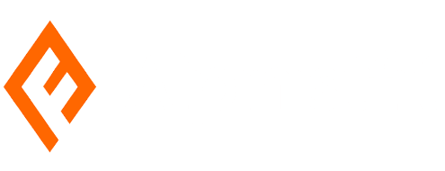

There are three versions of the logo lockup: black background, white background, and orange background. This makes sure that it stands out at all touchpoints. The smallest deployment size is 78 pixels on screen and 1.0 inches in print.
COLOR PALETTE
SAFETY ORANGE
MIDNIGHT SUMMIT
ICE BLUE
CERULEAN
Safety Orange (#FF6700) is the main action colour. It stands out, has a lot of energy, and is clearly linked to outdoor safety gear. Midnight Summit has a striking, authoritative look that makes it look like it knows what it’s talking about when it comes to technology.
TYPOGRAPHY
64PX / BOLD
Heading 1
48PX / MEDIUM
Heading 2
16PX / REGULAR
DM Sans is a modern, flexible font that is easy to read at any size. The letters are slightly tilted forward, which fits with the brand’s focus on progress.
05 BRAND ARCHITECTURE
Five values. One clear goal.
Performance First
Every decision contributes to function, safety, and performance. There is no artistic extravagance that does not deserve its place.
Lightweight Discipline
Eliminate the unneeded. Keep only what works. This approach applies to both the gear and the brand itself.
Mountain Respect
Recognising the power, restrictions, and responsibility that the mountain places on anybody who enters its vertical environment.
Reliability
Gear that inspires confidence at altitude. The brand promise is based on testable and repeatable performance, not just desire.
Focus and Speed
Designed for fast, precise, and efficient movement. Every visual and tonal selection reflects this guiding principle.
06 DELIVERABLES
A complete system that is ready for deployment.
Brand Strategy
Mission, vision, values, tone-of-voice rules, and an audience positioning framework.
Logomark and Logotype
The full symbol construction includes the logotype in all weights and various lockup combinations with three different backdrop versions.
Color System
Four primary colours have full tint ramps (ranging from 20% to 100%), authorised combinations, and variation parameters.
Typography Guidelines
Typeface selection, weight usage, type scale (24-64 px), and frequent error documentation.
Media Kit and Social Assets
Instagram, Twitter, LinkedIn, Facebook, and TikTok profile photographs with white, orange, and black backgrounds.
Brand Mockups and Flags
2D product mockups across gear categories, billboard and outdoor media simulations, and flag designs at 18×12″.
07 THE OUTCOME
A brand as lightweight and dependable as the lightweight equipment it represents.
Alpinistfit debuted with a brand system that conveys performance credibility right from the first impression. The safety orange logomark stands out at any size, from a 20×20 px TikTok profile to a full-width city billboard.
The brand rules ensure that all future touchpoints — clothes tags, gear packaging, internet advertising, and so on — can be implemented consistently by any designer, agency, or manufacturer in the globe without compromising the brand’s technical integrity.
“This is a brand shaped by time in the mountains, not trends.”
— Alpinistfit Brandbook, Made for Alpinist, v1.0
34
Pages of brand paperwork in five primary areas.
4
Core brand colours have full tint-ramp characteristics.
9
Logo variations covering all background scenarios.
5+
The media kit covers the following social media platforms.
Collaborate with
Yetistudio.co
We create brand identities for ambitious businesses. From strategy to final pixel, everything is built for real-world performance.


 using WordPress and